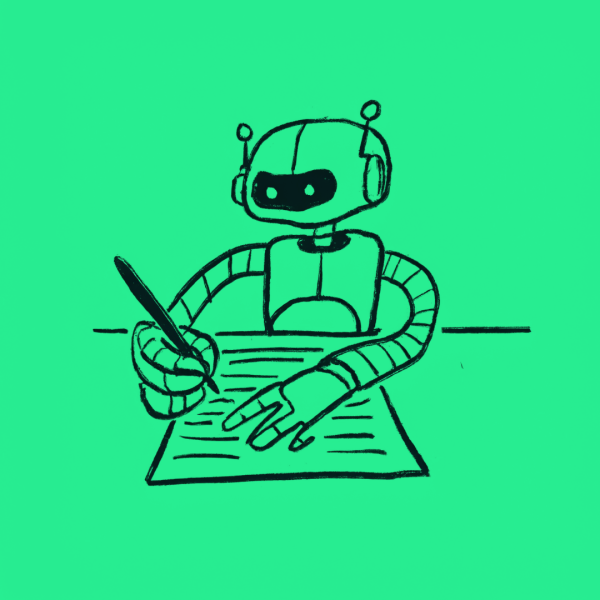
Brands need to find a better way to visualise AI
Short Read

Imagery is a vital component of any brand.
It can make the difference between a brand appearing dull, and it being seen as progressive, dynamic.
When it comes to imagery, there are brands that follow the adopted clichés of the sector, and those that define their own visual language. Following the accepted imagery style is undoubtedly the easy solution, but it will inevitably make a brand look like a copycat.
The representation of AI is a perfect example.
Image searches for ‘AI’ reveal a saturated world of clumsy visual metaphors:
- An eerie glowing blue
- Half human cyborgs
- Brains made of glowing, connected nodes
- Dystopian, inhuman scenarios

Google Image Search for ‘AI’
These clichés emerge for a number of reasons: the influence of popular culture (the ‘Ex Machina’ and ‘AI’ filmmakers, take a bow); their popularity on image licensing sites and subsequent visibility in the media. One graphic artist may have been commissioned to create an image that becomes recognised globally. Such an image then becomes a self-fulfilling prophecy: one robot and human with fingers poised to touch inevitably leads to a thousand other lookalikes.
The more conceptual the subject matter, the harder it becomes to create a representative image.
Many of the themes that brands wish to communicate are abstract; whether it’s collaboration, music, thought, transformation or success. But the most creative brands find ways to do just that.
Back to AI; with such a challenging, potentially troubling topic there’s a natural desire to humanise it. But AI isn’t a sexy robot, or an electric human brain, it’s more akin to a vast connected consciousness. An ocean, even.
If your organisation needs to show that it really understands AI, using a picture of a robotic head isn’t going to cut it. As more people become familiar with AI, these kitschy images of cyborgs and glowing brains are beginning to look increasingly out of step — in the same way that streaming services such as Spotify would never choose to use stock images of gleaming instruments or whimsical musical notes.
Look instead at how magazines such as Wired or The Economist choose to show Artificial Intelligence — or indeed any complex topic. They rarely focus on the literal — they choose to illustrate the effects, the potential or the human aspects, rather than the technology itself.
Related content

Brand Lessons From Businesses You Know: Oatly, HubSpot and Octopus Energy

When the product is ready, but the brand isn’t.
Inherited a Brand? How to Evolve It Without Losing Equity
How to talk to the next generation without losing everyone else